A Curated Refresh
Have you ever looked at someone else’s things and thought, “Ohmigod, that is the coolest thing I have ever seen! Where did you get that thing?” Usually their response is something like, “Target,” or “TJ Maxx.” But, not this client, her responses were, “Paraguay,” or “Italy,” or some random antique store in Amish Country. Her collection of art and antiques is unique and eclectic. It was my pleasure to refresh two rooms on her main floor and curate her precious items in a way that would bring them back to life.
Ilene has lived in her home for 18 years, she and her husband built the home and raised their two children there. When you have lived in a home for that amount of time you stop seeing things the way you once did. The “this is just how it has always been,” mentality grabs you and you focus on more important things! Inevitably, you will wake up one day and realize that you are long overdue for an update!
That’s when you call me.An Appropriate Office
“Does anyone really use that small formal living room space? Mine was a “holding space” for furniture – some items that we love and items we just had (got from family members, but never really wanted or loved). I needed a space to work from home and I was tired of sitting at my dining room table. Alyssa to the rescue – keep what you love, get rid of what you don’t (even if it does have family ties). The result pushed me a bit out of my comfort zone, but – WOW – I love every square inch of everything in this room.”
During our initial consultation and walk-through of the space, the formal living room looked just like you would expect. Traditional furniture, outdated window treatments and the cold-feeling of an unloved space. The room held obligatory things that represented memories or people that likely didn’t care whether those things were still there, or not.
So, we got rid of them.Ilene has a big, important job, at a big (not so important) company. Since the pandemic hit, she’s been working from her dining room table – overlooking the unused, unloved formal living room. With no signs of her returning to the office, the transition from formal living room to study seemed like the obvious change to make.
The Comfort Zone
Ilene and I have a history, she’s a previous client from my corporate event planning days, she and her husband, Rick, have become a dear friends. We have planned elaborate parties with beautiful themes, and to my knowledge, she was never disappointed with the outcomes. For that reason, I knew I would be able to push her a bit out of her comfort zone.
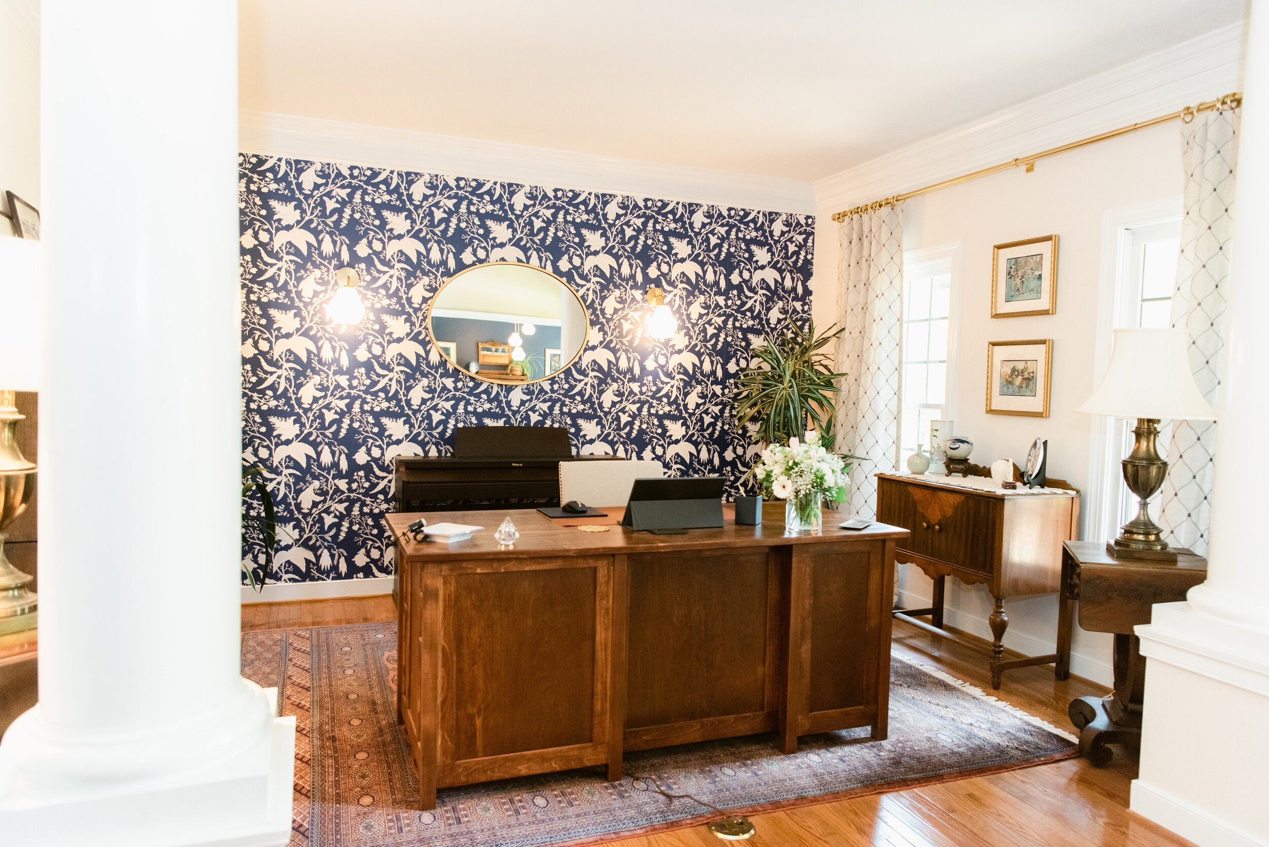
When starting a new project I like to find something that inspires the overall design of the space – in this room, it was the hand-knotted Pakistan Bokhara area rug. I’m telling you, it is the most beautiful rug that I have ever seen – it is timeless and would complement any design style that one might enjoy.
It is a busy pattern, but with only a few colors: navy and rust. Immediately I knew that an accent wall with killer wallpaper was the best way to take advantage of the rug. Ilene immediately knew that since it was a busy rug, she wanted a simple wallpaper – so, I showed her options and convinced her that my way, was the best way.
Tell me I was wrong. We used Wallpaperie’s Chinoise Reverse Peel-n-Stick paper.
It. Is. Banging.
The Wood.
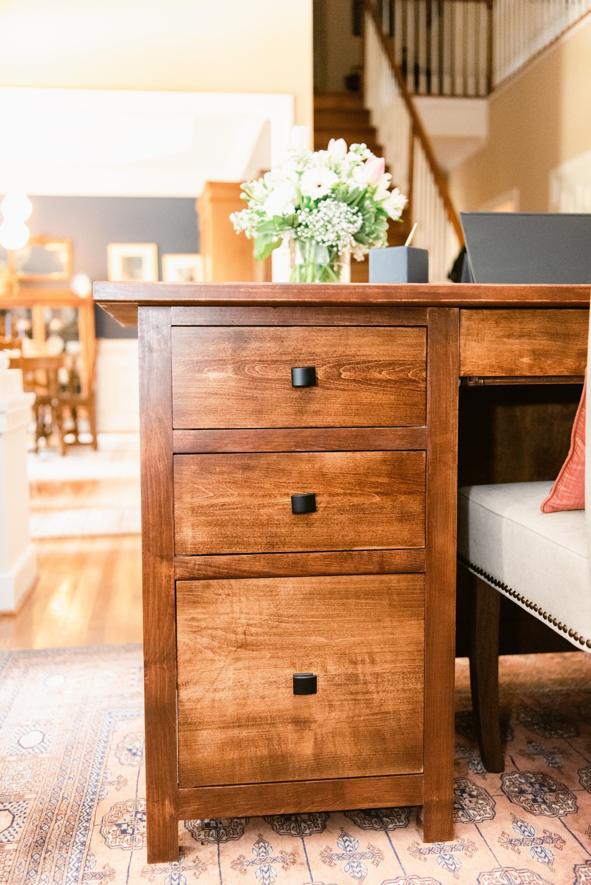
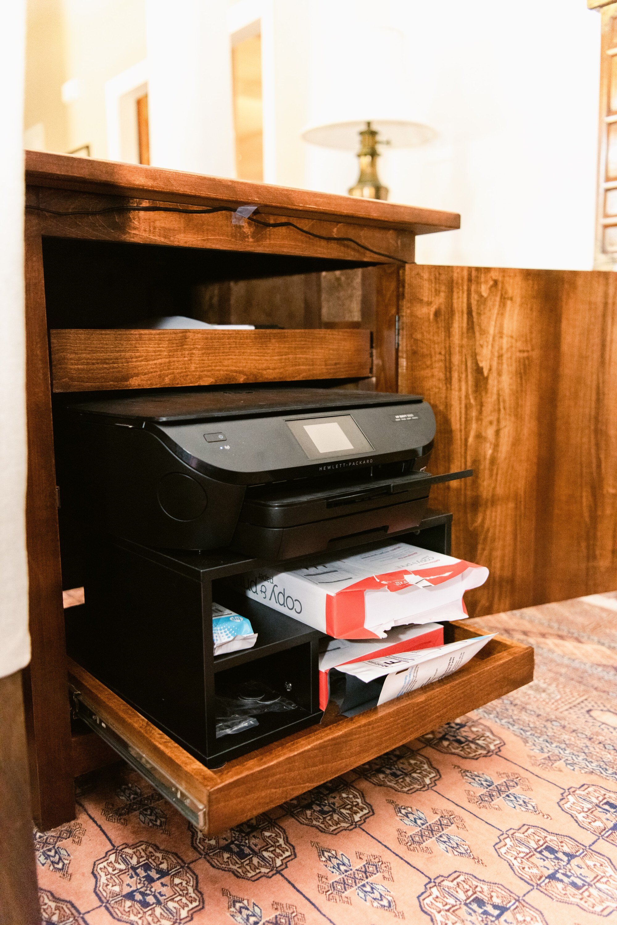
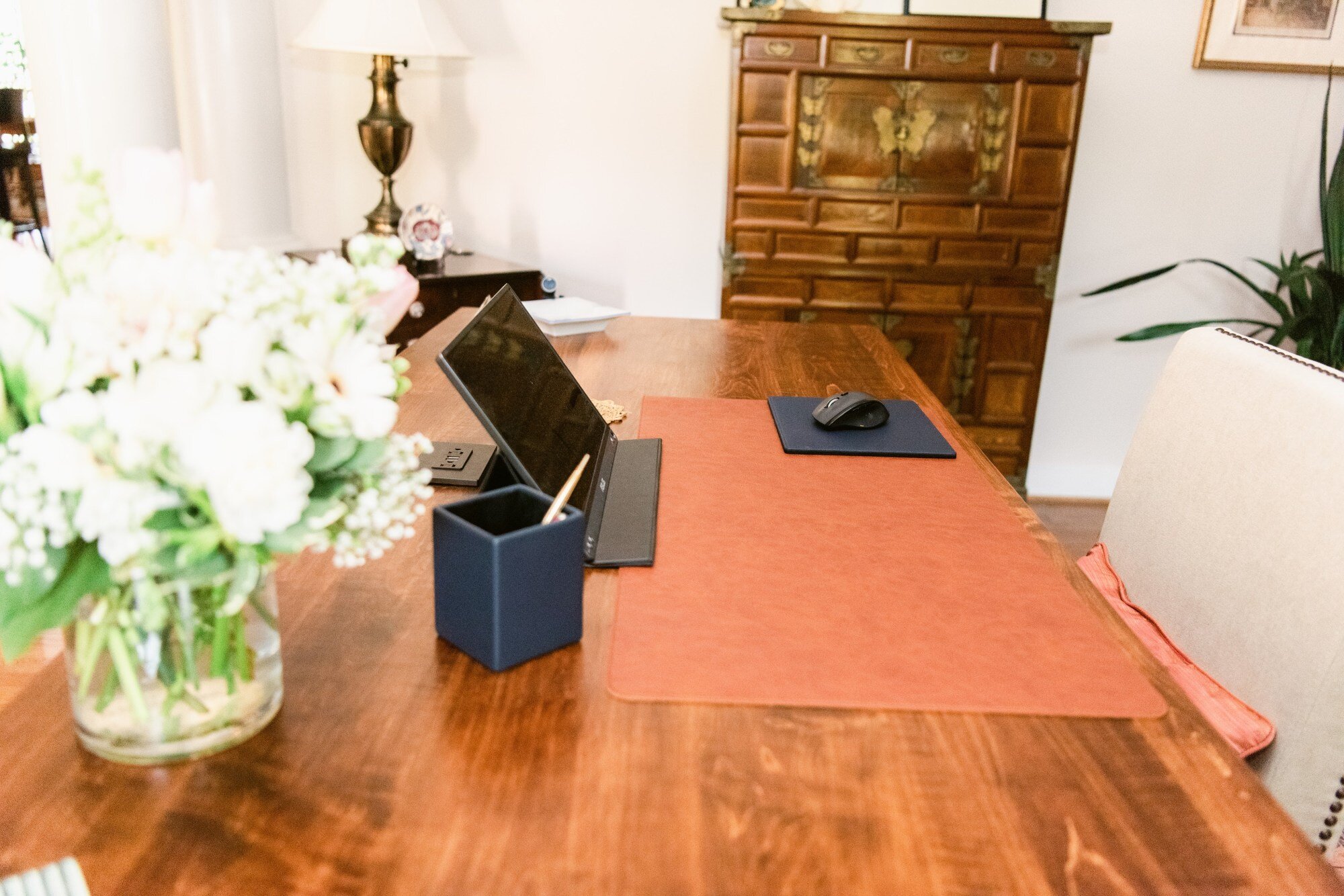
With this major decision behind us, it was time to focus on the furniture. Ilene did not currently have a desk but did have an idea in mind. My father-in-law happens to be a master woodworker and also happened to be for hire. We took notes about what was important to her and he got to work. The desk is made with maple and stained in Dark Walnut by Minwax , selected to complement the antiques that would live next to the desk. It has a curved front and fully finished panels that face out into the main entrance of the home. For functionality, the desk features pull-out trays that were built to hold Ilene’s printer, a keyboard tray, standard size drawers, as well as a drawer for hanging folders, and finally, power access built into the desk’s top.
Then there are the antiques in Ilene’s collection – pieces that she and Rick had acquired over the course of their 35-year marriage. I had my choice of items that were throughout their home and pulled in what I felt would complement the room.
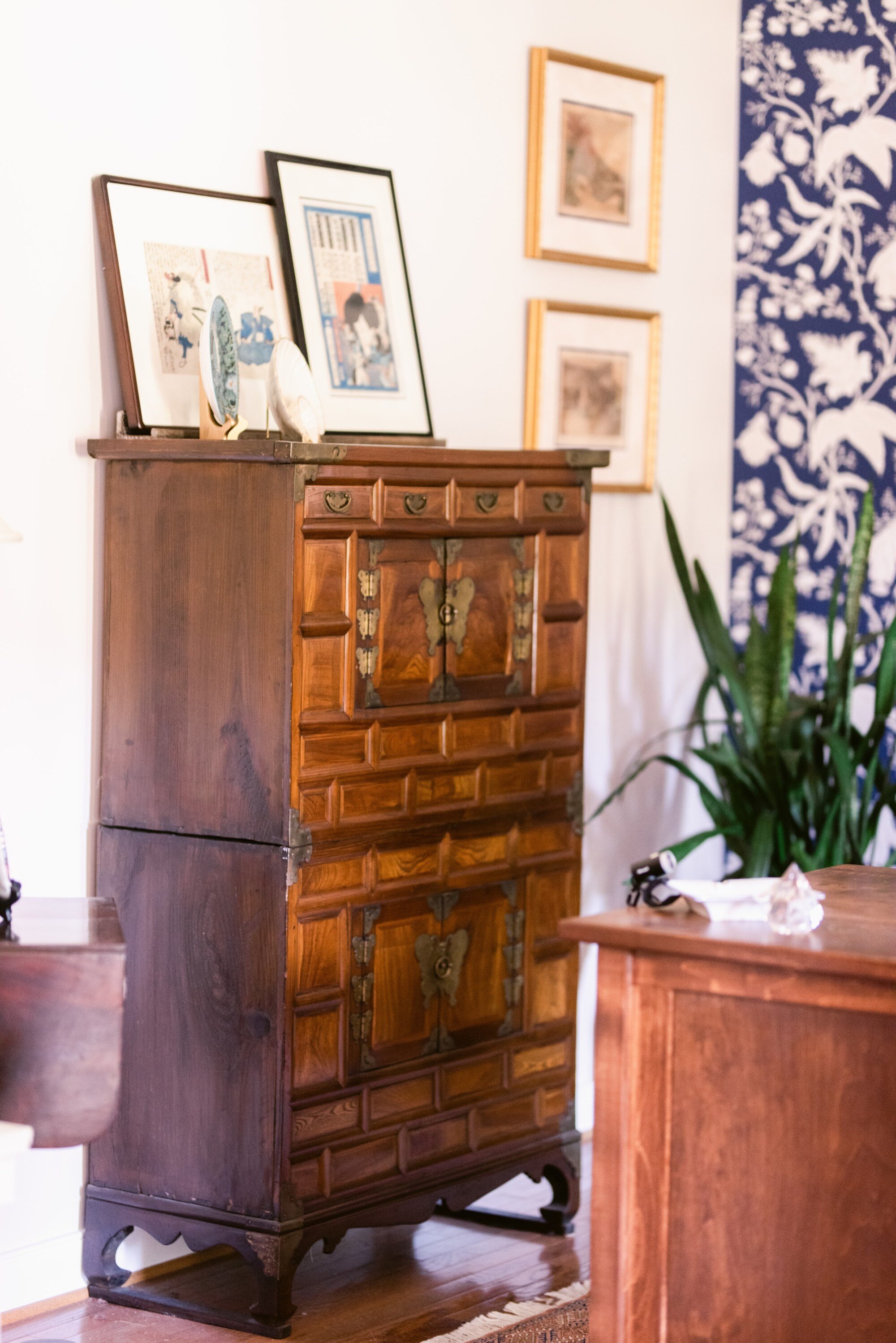
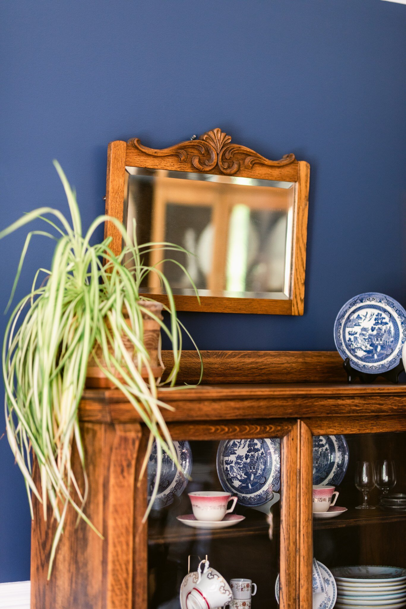
I drooled over an Early 20th Century American hutch with a butterfly-like detail at the seam of the doors, it is soft but makes such a statement at the same time. The room already housed the mid-1800’s Korean blanket chest, made of burlwood and lined with rice paper featuring detailed metal accents, but instead of blending into the room, it now stands out.
The Art.
I know a lot of people who have “art,” on their walls – you know generic pieces that go with the décor but have no real “art,” to them. And, there is nothing wrong with that, at all, I am one of those people.
But, then there are people who collect specific types of art and are truly inspired by them, in this case, Rick. He has a collection of Japanese wood block art that is ornate, rare and beautiful. Unfortunately it had been professionally framed in the 80’s in a manner that was doing no justice to the piece itself. So, we reframed them and rearranged them.
The Fluff and Stuff.
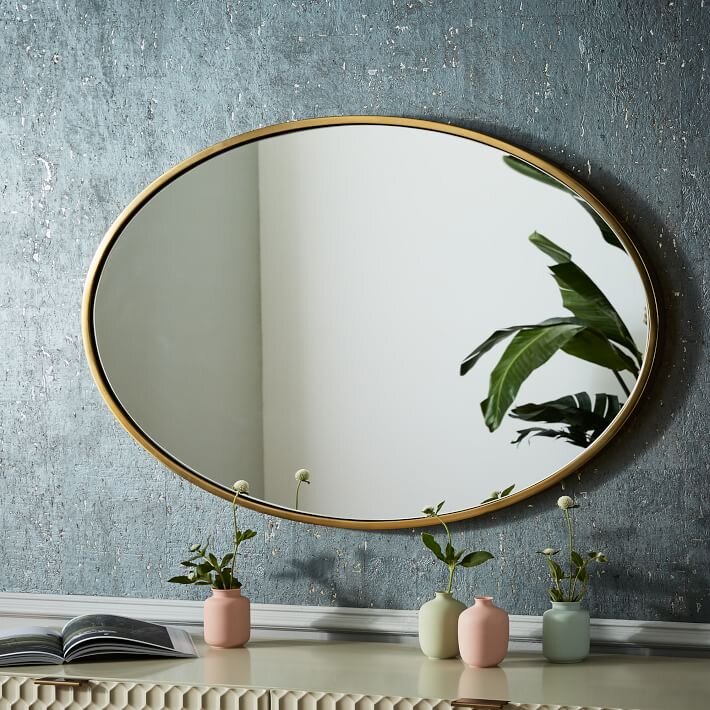
Any friend of mine knows that “fluff,” is not my favorite – and many of these friends are of the same mindset. The fluff in this office are acceptable brands of fluff: plants, lighting, window treatments and a gorgeous mirror.
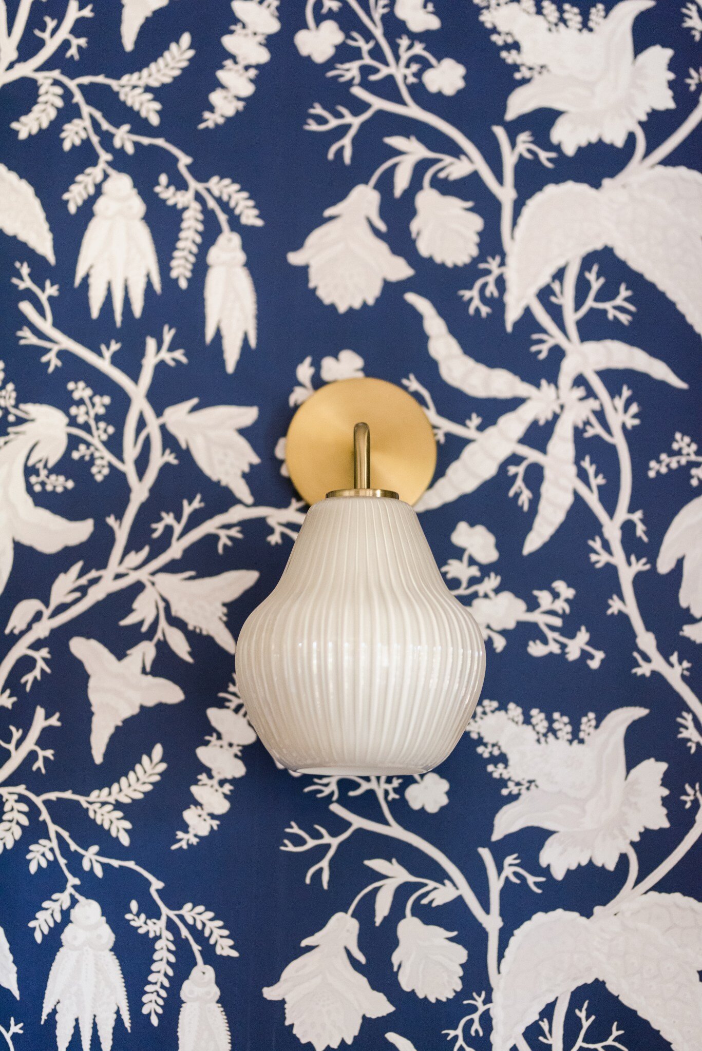
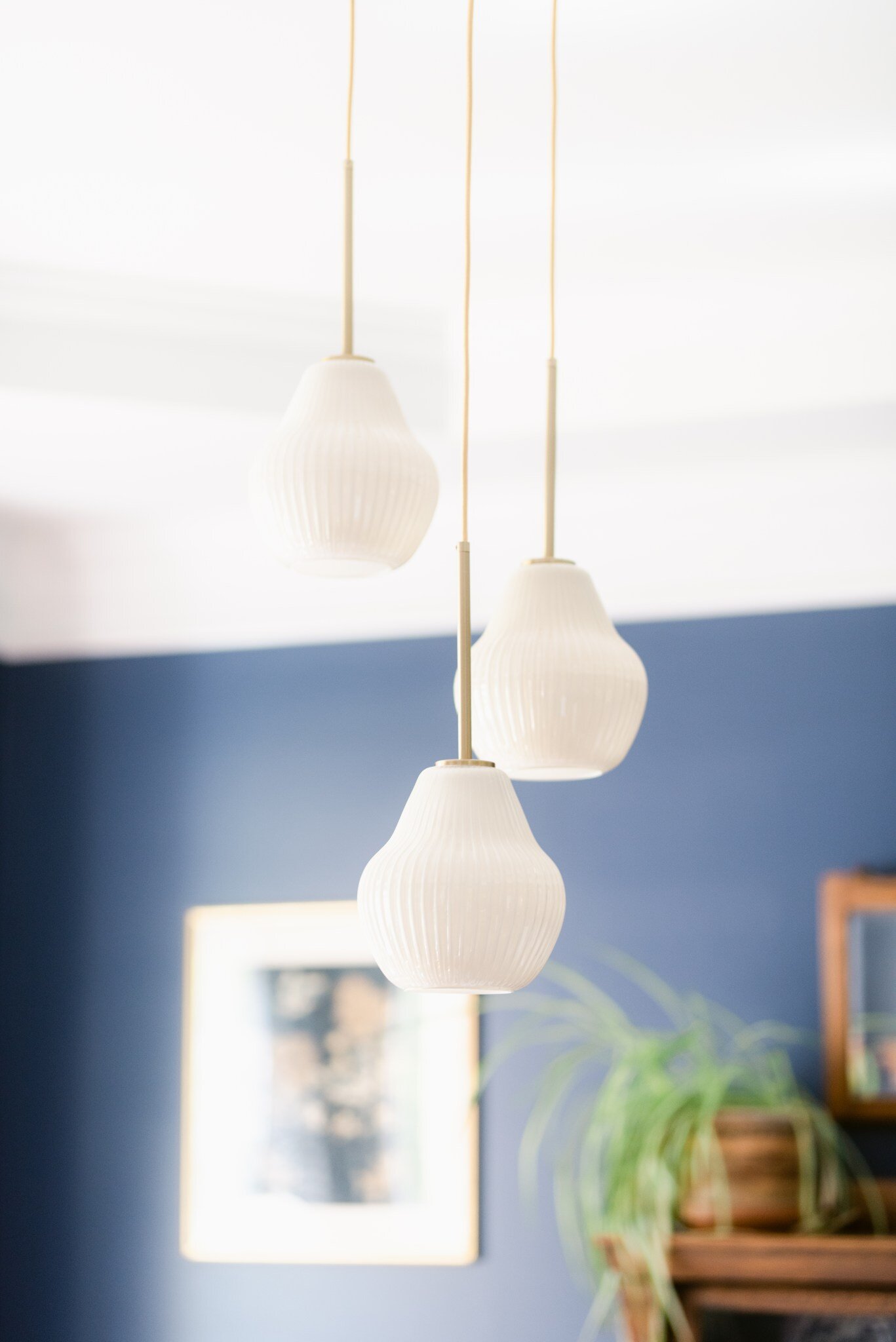
We wanted to choose lighting that looked modern but felt like art, and naturally, we wanted the lighting to coordinate with the other fluff and stuff. We headed to West Elm and chose a beautiful collection of gold pieces and these stunning sculptural ribbed glass sconces – to die.
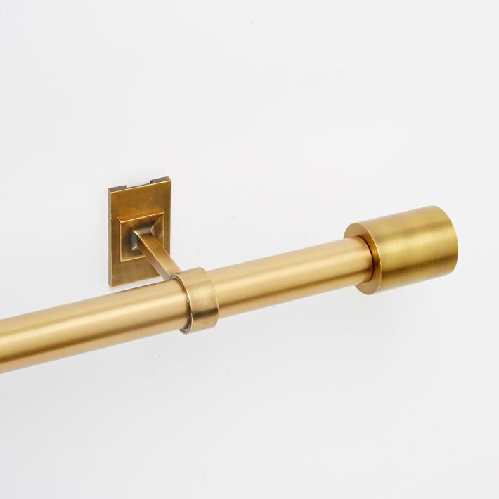
The fabric for the drapery was found at U-Fab in Richmond, VA, and custom-tailored in-house as well. (Head back up the blog to see the detail of the fabric, selected to let lots of natural light into the room) In order to keep with the minimalist approach, we opted for one curtain rod that extended the length of both windows and installed it several inches above the window frames to create additional interest and height.
Across the hall.
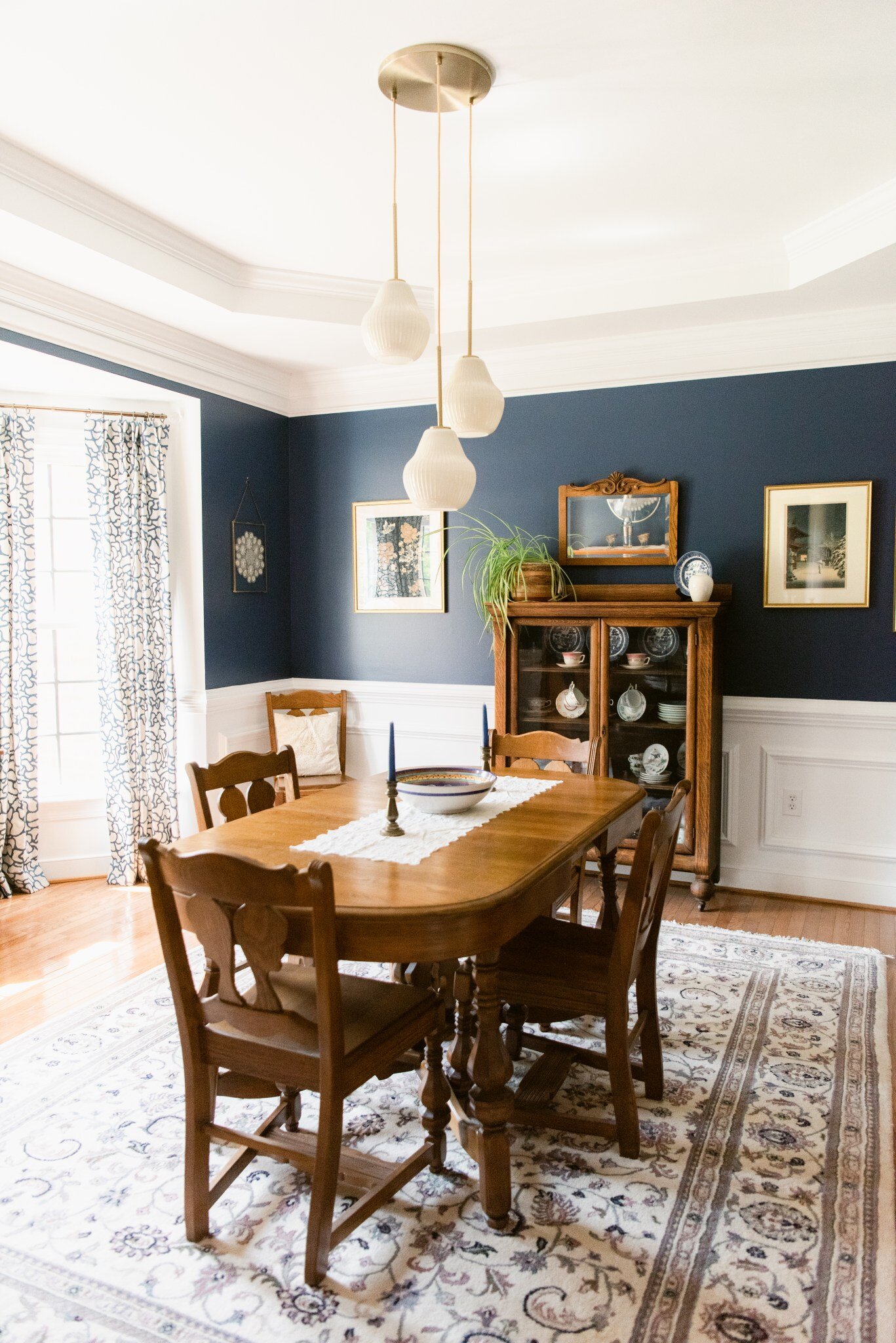
In conjunction with the office, we also worked on updating her formal dining room. With these spaces being across the hall and open to one another, our goal was to create spaces that were cohesive and complementary.
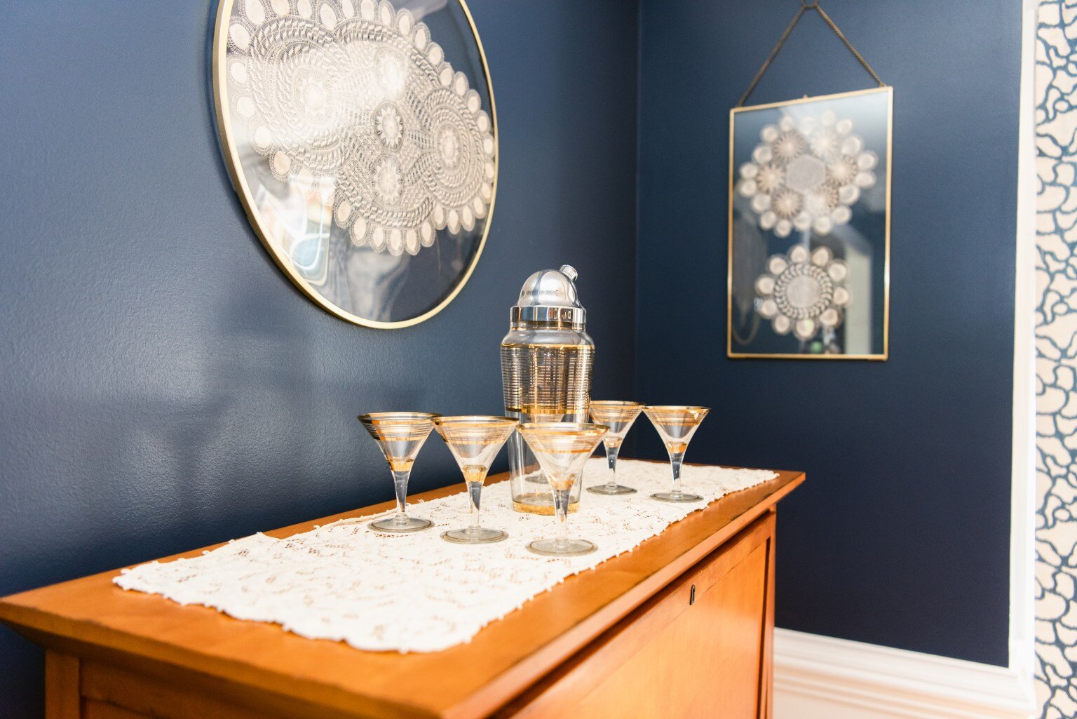
The art, antiques, and collectibles were also the primary focus of this room. We framed some items that were previously kept in drawers and reframed dated pieces to blend with the décor.
Down the hall.
Ilene and Rick have a great open concept in the main part of their home, the eat-in kitchen is large and overlooks the family room. As with the rest of the home, it hadn’t been updated much since it was built, so we made some changes that brightened up the space.
“In a design/planning session one day as Alyssa and I chatted in my kitchen/family room area, I just blurted out “look how dark this room is – all of this beautiful sunshine outside and it’s dark, brown, dark”. Well Family Room design now in scope. Alyssa’s design ideas changed the size and feel of the room just by flipping focal points, adding built-ins, getting rid of bulky cabinets, and paint. We decided to add the large wood and glass door to showcase the renovated 3-season porch we had just completed in 2019.”
All Good Things Must End.
As with any good Covid-based project, we faced our share of delays on this project, starting discussions in August, project starting in November and ending mid-February. Luckily Ilene and Rick were gracious and understanding about the delays, but were over the moon when everything finally came together. And of course, so was I, and all good things must come to an end.
photography by Kia & Co


